Color is the way we express and feel. It is a designer’s vehicle for creating mood and emotion. It is one of the most important items in our tool box.
Curiosity got the best of us, and we wanted to look into colors, one by one. Where is it found in Nature? What were the chemicals, plants and recipes used to reproduce it over the years? And what does it do for us in a room?
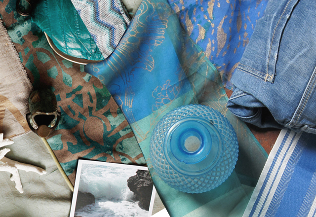
We wanted to start with BLUE, a primary color — meaning one of three pigments which cannot be made from other colors — it just IS. The other ones are yellow and red. In nature, we find blue both in the sky and in water. Very large open surfaces, stretching to the horizon, where they often meet each other in a flat line. For this reason, we associate blue with tranquility, peace, calm and spaciousness, freedom.
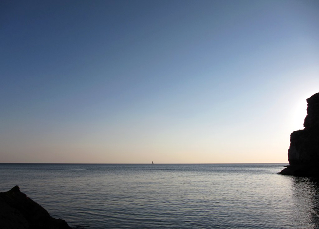
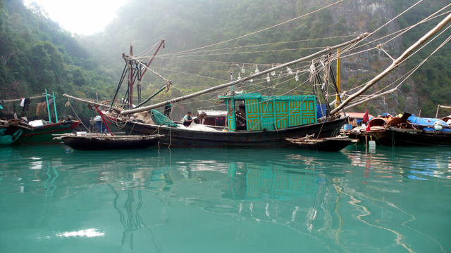
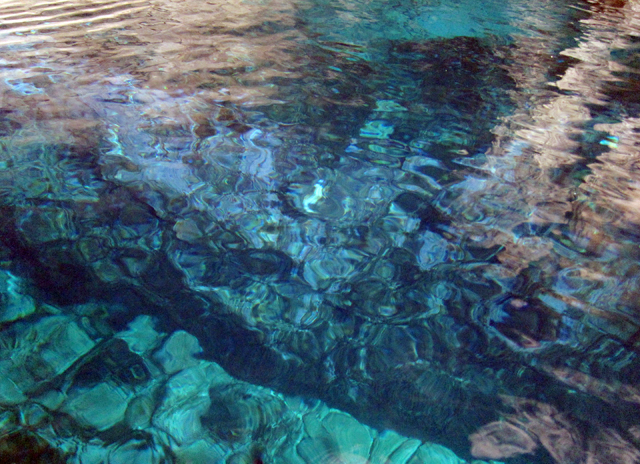
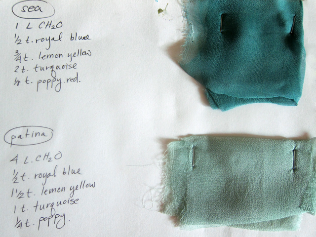
Of course there are many shades and varieties of Blue, but they basically break down into two families: First is Aqua, Turquoise or greenish blue. Sea water reflects the sky with golden sand tinting the blue reflection from below, creating that Aqua color we know and love. As the water gets deeper, so does the shade of blue until it becomes the inky, ultramarine colors found in ocean depths. We all know that the name for the color is synonymous with water in latin languages — agua, acqua, etc.
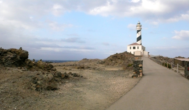
The other family of blues comes out of the SKY, with its more cool, even purple-ish hues. This is the backdrop of everyday — ranging from moody blues on a cloudy day to bright blues of a clear sky, to purple and lavender shades when the sun sets. The perception of transparency and space which is our sky gives this color its association with freedom and peace.
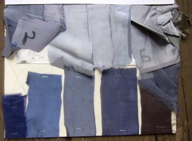
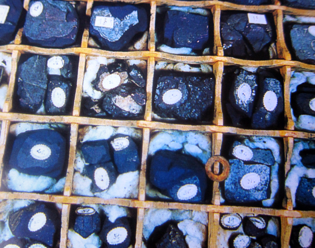
In the age of exploration, dyes and colorants were a precious commodity, as valuable as spices or silk. Indicum, or indigo blue, was one of the principal imported materials. The concentrated color extracted from the indigo or woad plant was transported in pans made of compacted powder. The dye produced from these was more or less purple, depending on the provenance.
A record from 1228 notes that Marseilles imported one of the best indigos from Baghdad. By the 19th Century, Napoleon’s Grand Army imported 150 tons of indigo to dye the uniforms of 600,000 soldiers a year. By the end of that century the British factories in India were the foremost indigo producers in the world. Below, raw indigo from Java, India and Baghdad.
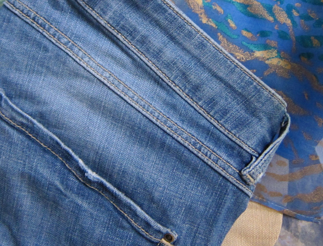
This is how we got Blue Jeans — dying heavy duty cotton twill with indigo, and making work clothes for the new frontier out of it.
Medieval painters mostly used mineral pigments for color — blues came from Lapis Lazuli or azurite. Medieval manuscript illuminations were painted in monasteries, which obtained their colors from a variety of sources.
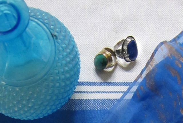
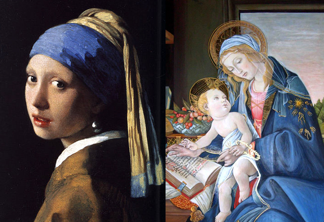
Lapis Lazuli was the most prized of blues. Neither azurite nor indigo could rival it, although they were more ancient. The process of extracting the precious blue powder from the raw rock was long and arduous, and involved mixing the ground stone in a preparation made of Venice turpentine, resin, oil, and wax, which drew out impurities. We do not know the origin of this procedure, but there are countless variants of it in the old recipe books. Below, two well-known works by Vermeer and Botticelli which made extensive use of lapislazuli.
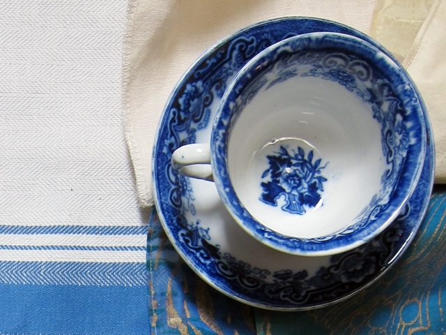
Blue is a big color in Glass and porcelain. Handpainted cobalt–from Blue Willow in China to Wedgewood in Britain is a classic–and that delicate sea glass color has been around since ancient Egypt.
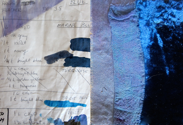
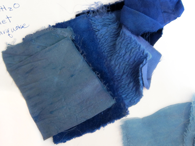
Over the years, in our own studio, we developed many recipes to print and dye our fabrics. Its amazing to see how colors like lawn can turn into sea, which becomes royal, and finally purple haze by adding grains of one color or another. Truly an alchemical art.
We thought you might enjoy seeing some of those recipes, and included some of them in this post. Below are some images of the end result. All designs by Susan Unger.
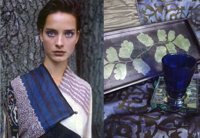
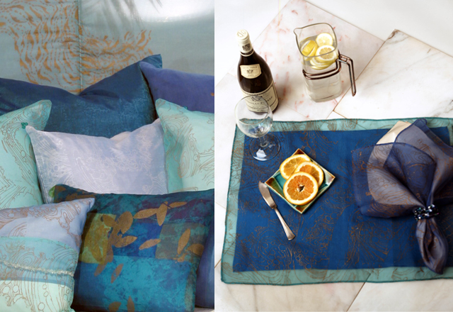
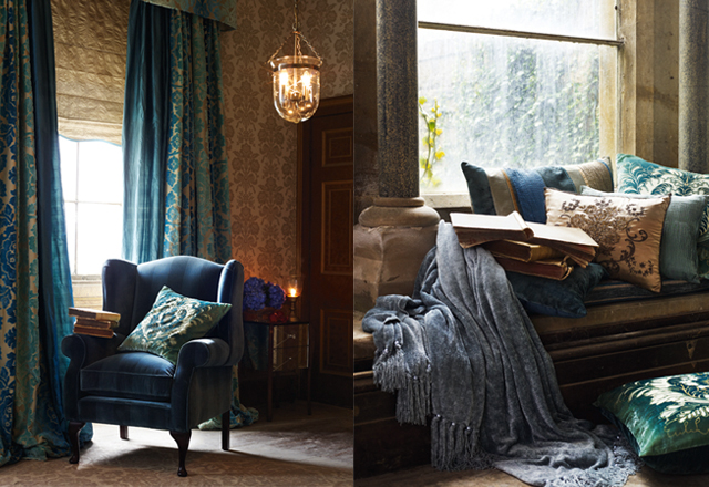
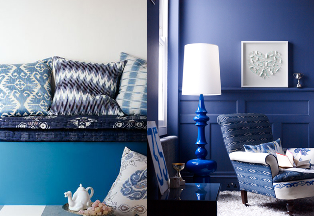
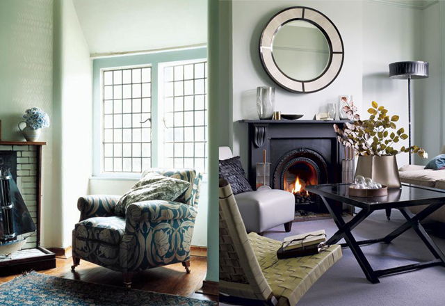
Use blue to feel peaceful and tranquil. It’s good for a bedroom, or a background to quiet contemplation (such as an office). It’s more about thought, rather than passion. Its sky and water, as opposed to fire and earth. When you’re looking at a room in your home, think of where those colors are found in nature. If they are positioned in the room in a way which resonates with where they are found nature, the emotional connection will be more powerful. You will bring a bit of nature inside.
All images below are by photographers represented by Sarah Kaye.


Hello,
Congratulations on your beautiful site! Actually you make people want to go to Menorca!
I’m sorry to bother you and I know it is not related to the site but we are desperately looking for a nice old farmhouse to rent in Menorca during August. If you know of anyone willing to rent…
I’ asking just in case..we never know..
Thank you in advance for your help! and once again congratulations..
Hi Felipa!
Thank you for your kind words! It would be my pleasure to send you the email of a person who rents her farmhouse in August. If I think of any others, I will send you those as well as some restaurant suggestions — now that I think of it, I should finally start the BiniChic Travel section I’ve been thinking of doing for a while… Best, Ona