Mediterranean Style: The BiniChic T-Shirts

As many of our readers probably know, BiniChic embodies for us the Mediterranean as a lifestyle and a place. Through our blog and designs, we aim to bring you closer to its characteristic light, colors, art and culture — the impalpable things that make it so special and unique. Designed and hand-printed in Barcelona, we developed the BiniChic T-shirt Collection as a way to share and wear our vision of the Mediterranean.

The collection of limited edition t-shirts is divided into four prints, each representing an aspect of our Mediterranean heritage — and the different women that we imagine wearing our t-shirt designs. We delved into our creative vaults to find some iconic prints by our co-founder Susan Unger. Each design was selected to create a varied and balanced range where everyone could find something they liked.

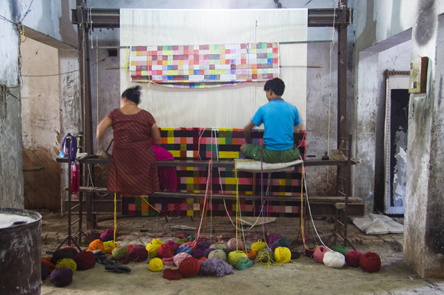
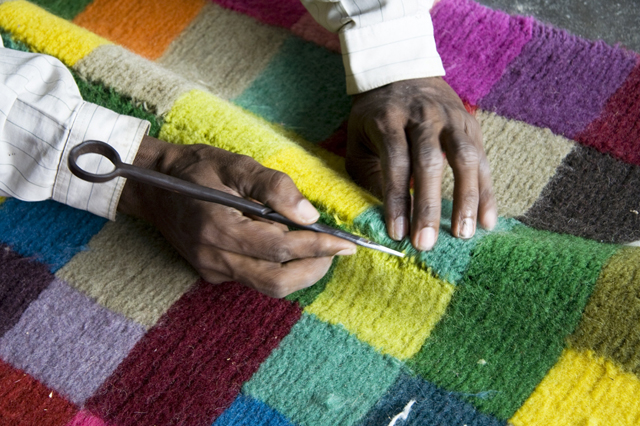
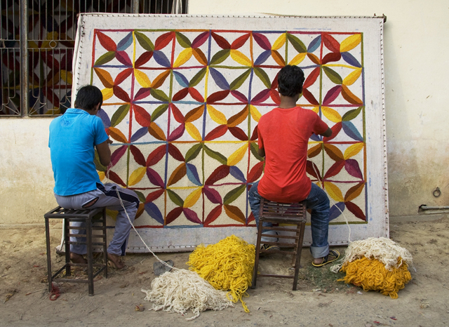
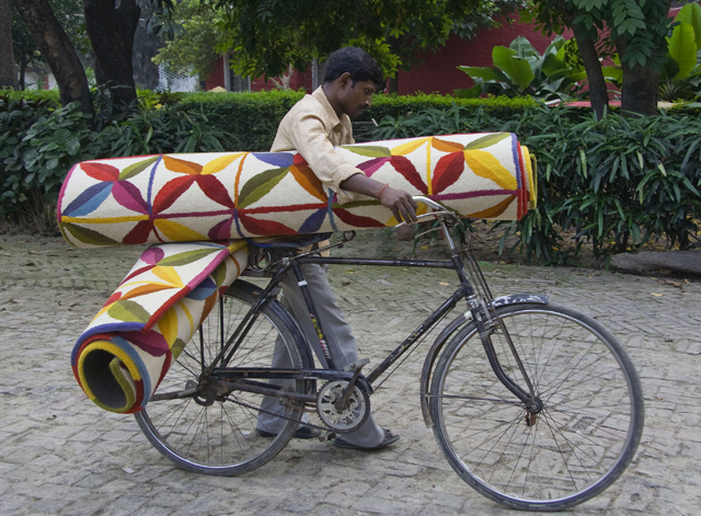
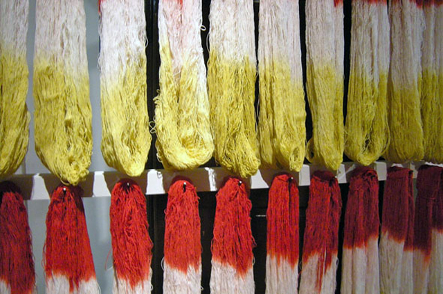
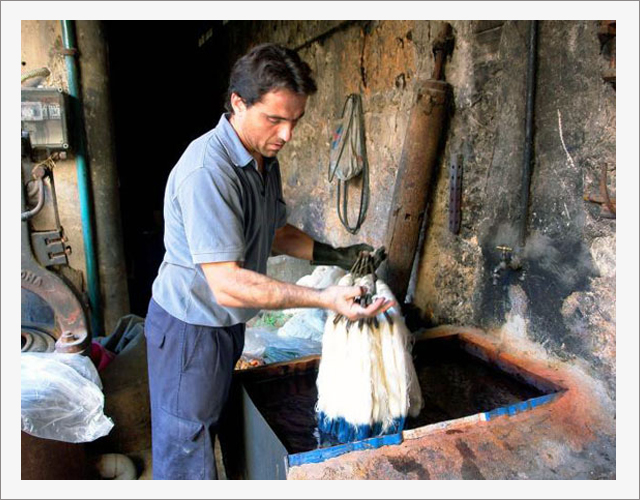
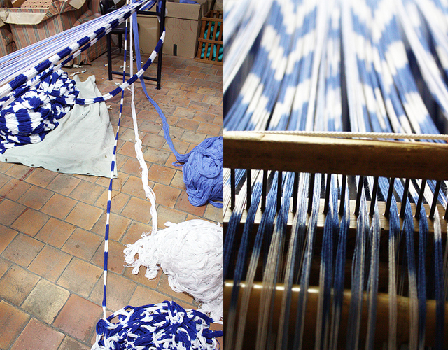
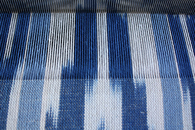
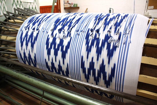
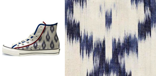
The Ikat print (pictured above) is inspired by the Llengües, the traditional Mallorcan method of weaving dyed threads into zig-zagged prints we posted about some months ago (pictured below). We gave it a new approach by using Nordic-inspired colors, such as ice green, warm grey and ancient gold, adding elegance and versatility to this traditionally bright print.

Each design is directly inspired by our experience and our relationship with the Mediterranean. The cut of the t-shirts — a loose tank top with a racer back and a t-shirt with a rounded scoop neckline — are easily worn by women of different body shapes and lifestyles. The t-shirts come in white, pink, taupe and black, depending on the availability of the print.

Most of the photos throughout this post are from our recent visit to the Cyclades — the epitome of the Mediterranean lifestyle (that is, besides our home-island of Menorca)

Fresh and summery, the Wave print is the perfect complement for a day by the beach or at your summer destination. An updated version of an original Susan Unger design, we wanted to create the feeling of “Postcard from the Sea” by combining the illustration with a handwritten excerpt of a poem about the waves below and the two BiniChic stamps on the upper left corner.

The Egret on the Fauna print was inspired by the elegant birds that flock yearly the Menorcan Reserve of the Biosphere in s’Albufera des Grau. In tones that remind us of sandy walls and earth tones from volcanic beaches, we combined the main print in warm gray with a flock of japanese-inspired birds printed in Ancient Gold.

The Olive Tree is one of our favorite motifs, one with which we greatly identify. A symbol of peace, wealth and good health, this resistant and ancient plant is believed to have been cultivated as far back as 7000 years ago.

This tree has always had a strong presence in our lives. It was the name given to our home in Menorca, S’Olivera. Later, Susan developed a line of products including lacquerware for J.Fleet and home furnishings inspired by the elegant movement of the olive branches. Incidentally, my husband’s family makes a delicious Tuscan Extra Virgin Olive Oil, (look out for it soon on BiniChic!) — further making this our “family tree”.

We reinterpreted this classic Susan Unger print to create a t-shirt that never goes out of style. The Antique Gold that Susan used throughout her collections gives a touch of glamour to a t-shirt easily combined with any look.

Comfortable and elegant, trendy and classic — which BiniChic T-shirts best represents your style? We’d love to hear your comments!

If you’d like to see the entire collection, visit our BiniChic Store here.

Posted in Uncategorized | Tagged , , , , , , , , , | Leave a comment

Midsummer Night’s Wedding – The Invitation

Today we start a series of posts dedicated to the various aspects of what it takes to create and organize a BiniChic wedding. Jacopo and I will be getting married this summer in Tuscany (where he’s from), and thought you might enjoy seeing the making-of of our Midsummer Night’s Wedding. Let’s start with the invitation:

The concept and production were a group effort, with everybody in our families contributing their expertise and time in one form or another.

The first element you see of the invitation is a 17x17cm folder made of hand-made linen paper. On this folder we printed a scan of a silk tulle embroidered with a motif inspired by a Modernist cast iron lamp that hangs in the kitchen of Il Cicaleto, the villa where we’ll have the wedding.

This is the beautiful lamp, whose design inspired the embroidery below, which will also be making an appearance on my dress (but don’t tell Jacopo!) The drawing for the embroidery was created by my mother Susan and our talented friend Shezi.

The folder, along with all the other hand-made paper elements of the invitation, were made by my step-mother Núria in her Menorcan workshop.

We thought it would be a nice touch and a good contrast in color to close the folder with a wax seal. When designing the “icon” I went through many designs, finally realizing that our “logo” had been right front of me the whole time:

This is the beautiful vintage engagement ring Jacopo picked out and gave to me on October 9th, 2011 (incidentally, it was also my birthday). The ring is a Modernist piece from the early 20th Century with rose-cut diamonds set on a gold band. He found it in a quaint little antique shop in Barcelona’s Passeig de Gracia.

The process of putting on the wax was long and tedious, and we only really got the hang of it after many practice runs (and botched efforts). We learned the following about applying sealing wax: 1. close the lid well while applying the wax so it doesn’t go under the flap 2. Let the wax cool a bit before putting the seal, otherwise they will probably stick together (a good trick is to dip the seal in ice water when it gets too hot) 3. Burn the wax from the top, not from under to avoid the unsightly black smoke 4. Use a good quality kitchen lighter so as not to burn your fingers.

Once the seal is broken, you open up the invitation to find an original linoleum etching made by my father, Marcel, on the left inside face of the folder. The etching represents Jacopo and I as turtle doves perched on a tree under a full moon.

Fresh, original and fun, we thought it would be nice for our friends and family to have as a souvenir of our wedding.

Opposite the etching, we placed a sheet of hand-made linen paper with the details of the event. The paper was folded in half, and on three of its four facets the information was printed in Italian, English and Catalan — which was the only way all of our guests would understand it.

The font I used for the text was Mrs Eaves, and although it was designed in 1996 by Zuzana Licko, it has the antique feel of the 18th century fonts designed by Baskerville (after whose wife MrsEaves was named). For our names I used the display face font, Lafitte.

We hope you’ve enjoyed seeing and reading about our BiniChic wedding invitation. In the coming installments we’ll cover the making of the dress, the reformation of Il Cicaleto, the flower arrangements, the event design and many other things! Stay tuned.

And here we leave you with our own little version of the assembly line:

Thank you Susan, Marcel, Núria, Isa, Pietro, Carlos and Shezi for helping make this invite so special.

Posted in Uncategorized | Tagged , , , , , , , , | 11 Comments

Designing for Today

“A design isn’t finished until somebody is using it” — Brenda Laurel
A perfect reflection of the philosophy that drives the Barcelona-based design studio 3Patas (3Legs in Spanish), whose innovative projects invite the user’s interaction and personalization.

The 3×3 table — a simple 3-legged one at first sight — is a collection of auxiliary tables and stools, which neatly combine with two bowls to form a family.

With clean lines and a soft palette, it is clearly a product developed out of the contemporary necessity to save space in small apartments. It can morph to be used in various ways in different environments, and adapt to its users’ necessities. The more I look at it, the more I realize I really need one in my own home!

3Patas are three young, creative and daring designers, making themselves a place in a world of design. Their products — which include the above-mentioned table set, various lighting designs, shelving systems, as well as many other projects — all aim to find solutions to concrete problems using the emotional experience of the user as a guide.

Constantly in the “search for innovation, always maintaining the warmth and the collective imagination which give our products a human touch.” (from the 3patas website)

The Worley Lamp seen above was part of a project developed originally for a private home in Barcelona’s Left Eixample. The lamp’s structure is made up of three bent tubes, always making right angles and at whose ends a light bulb falls vertically from the ceiling at different heights. The group is painted with black piano lacquer, giving the piece sobriety and neutrality.

3Patas also designed the dining table in the same room, taking into careful consideration the chairs with which it was to be paired. The interior designer had chosen Jean Prouvé’s Standard Chair from 1934, so 3Patas designed a table whose legs echoed the iconic design of the chairs, including a shelf where a user could rest their computer or books.

A metalworker was hired to bend the tubular steel legs in three dimensions, something which involves a complex process. The result is a visual and material harmony between the classic chairs and the bespoke table.

For another client — the Barcelona restaurant Suculent — they added kitchen pots to the Worley Lamp to act as shades.  This time, the lamp turns on in three different phases, so the lamp can be brighter or dimmer depending on the number of guests dining at the table. A clever and playful way to resolve the problem of dimming and focusing the light in a restaurant.

I’ve always liked finding new uses to old objects — and seeing how product designers take that to a new level. For the same restaurant as the Pot Lamps, the designers created this series of wall lights from discarded XL sized tuna cans.

The Teja Shelf takes its name from the clay roof tiles typically used in the Mediterranean homes. A modular piece, it allows the user to configure the shelf in whichever way is more suited to its use and space.

“In times of crisis, only imagination is more important than knowledge.” In this quote from Albert Einstein, 3Patas find a reflection to their philosophy when creating projects that are useful, thoughtful, innovative and aesthetically pleasing.

In the economic climate we are currently living in, the designer’s most important role is to fulfill the user’s needs while being resourceful and imaginative. I am not alone in thinking that 3Patas has a long career ahead of them. They have been nominated to the prestigious ADI-FAD Design Awards for 2012. We wish them all the luck in the world and will stay tuned for their upcoming works!

Posted in Uncategorized | Tagged , , , , , , , , | 3 Comments

Bringing Nature Inside – Part II

Authentically BiniChic, Susan Unger’s home and fashion creations have embellished many homes and dressed countless women around the world. A few months ago, we shared with you the beginnings of her career on the island of Menorca (if you’d like to review it, you can do so here). Today we will pick up where we left off, continuing with her journey to another island: New York.

In the early 1990s, Susan Unger opened a boutique in Madrid and teamed up with various artists such as the choreographer Nacho Duato to design costumes for his ballet “Duende.” The project thrilled her, because “It felt like the Ballet Russe of old. The ethereal combination of movement, light, color and fabric was seductive.”

Her friend, the singer Maria del Mar Bonet has often been her muse, and throughout the years, Susan has designed many of her costumes often inspired by Ancient Mediterranean myths and goddesses. In 1992, she also collaborated with Els Comediants, a Barcelona theater group, on the opening ceremonies for the 1992 Summer Olympics.

The Susan Unger fashion line was picked up by Barneys and Charivari in New York where Donna Karan fell in love with the colors, textures and prints of the collection. She subsequently offered to finance a studio for Susan and talked her into moving to Manhattan the following year. The collection of hand dyed and silk-screened velvets for Ms Karan were a success, and by the fall of 1994 we (Susan, myself and our dog) were living in Manhattan.

Below, an image of Susan’s dresses on the Bergdorf Goodman’s window and the Donna Karan dresses made with Susan’s fabrics.

Susan’s fashion collections were characterized by their femininity, their transparent layers and timeless elegance. Susan’s was a rare blend of artisan-couture. Her product wasn’t so much about fashion, as it was about a sophisticated, yet easy, approach to living.

Her fresh vision earned her many fans — among them some celebrity clients including Carly Simon, Glenn Close, Diane Sawyer, Uma Thurman and Donna Karan.

The natural next step after having a successful fashion brand for many years was branching out into the home. Ethereal floating panels, duvets, decorative pillows, lamps, wallpaper, lacquer trays and other home accessories formed part of her the Susan Unger Home Collection.

The splendor of Byzantine art, Mariano Fortuny, William Morris, the nature around her, the unspoiled countryside, the beaches, and the mysterious ruins of the Mediterranean all informed her designs. She has the gift for transforming the elements from Nature, Art and Architecture into stunningly original fabrics for fashion and home furnishings.

I still remember an anecdote my mother told me about finding inspiration in the most unexpected places. She had been sitting in our Menorcan kitchen table the whole afternoon, trying to come up with her next collection. It got late, so she went to bed. The next day, she opened the kitchen door (below), and there — between the edge of the heavy wooden door and the stone frame — she found what looked like a fossilized gecko. The gecko print went on to become one of Susan’s most successful prints — so we can say that inspiration can literally be found around any corner.

Surrounding yourself with Susan’s home designs feels like lying under an olive tree as the light plays through the gray-green leaves or watching the wings of a dragonfly shimmer in the sun.

Subtle metallic inks pick up light, much as rays of sun play off a blade of grass or a ripple in a pond.

The collection of lacquerware she developed for J.Fleet — whom I still collaborate with to develop new prints — was an exploration of new surfaces and textures. The beauty of the nature-inspired prints was heightened by the richness of the shimmery materials and quality of the lacquerware.

The ultimate way of “enveloping” oneself with the Susan Unger lifestyle was the 72-piece collection of wallpapers she designed for Sterling and printed in Milan, Italy.

A beautiful project, Susan was involved in every part of the process, from choosing the exact color mixture to approving the final roll of printed wallpaper.

Gorgeous and diverse environments could be created throughout the house. Light and airy leaves for the bedroom, rich ochre for the dining room, inspiring red for the office.

I was particularly a fan of this project, as I feel that with minimal decoration it gave each room in the home its own unique personality.

Six years ago, Susan got a great opportunity to become part of the JCPenney team, and to continue designing beautiful things — this time in a whole different scale. It was no more hand printing or dying in bathtubs. Now she splits her time between Dallas and the rest of the world — where she often travels for inspiration and to oversee the production of the Studio line for which she is head designer.

As I’m writing this post, I realize how long and complete my mother’s career has been — and it’s not over yet! So many beautiful things have come out of her mind and workshop! Almost too many things to mention in one single post.

If you are now frowning, wondering where you could get your hands on a precious and one-of-a-kind Susan Unger accessory — worry no more! You can hop over to the BiniChic Store , where you’ll find a selection of her beautiful pillows. We will shortly be adding more things, so come back to visit!

I will soon post another article on the blog, since I haven’t been able to do so lately due to the load of work and my upcoming wedding (yes, Jacopo and I are getting married this summer!).

We thought you might enjoy seeing the making-of our BiniChic wedding. From the hand-made invitations, to the flowers and the dress — so we’ll be sharing that with you in the upcoming posts. Stay tuned!


Posted in Uncategorized | Tagged , , , , , , , , , , | 17 Comments

Islands of Color

We’re back! Thank you for your patience while we have been immersed in the creation and launch of our new BiniChic Store, which you can check out here. We hope you enjoy it and keep coming back for new products, blog posts and news! Now, back to our scheduled programming:

Known for her elegant and simple carpets, Nani Marquina creates with a material and manual process in mind before sketching out the design — instead of the other way around. The results are unique rugs with the precise and essential level of design each material calls for.

Time is the best designer. When we look around us, we can see that many of the products that have stood the test of time were not even “designed,” but have come about from an organic development of an ancient process.

We have previously written about vernacular arquitecture, where the materials and methods of construction are a reflection of the surrounding habitat and resources. When vernacular manufacture and materials are mixed with an original contemporary vision, the results can be incredible.

A renowned designer and entrepreneur from Barcelona, Nani Marquina runs one of Spain’s most international companies, selling hand-crafted carpets in the five continents.

One of Nani’s strengths is creating carpets that fit any modern lifestyle, adding the final touch of design and comfort to any living space. Another one of her strengths — not to be underestimated — is her capacity to choose some of the best designers alive to collaborate with her on the creation of new models.

Above, photos of the process of creation of the Digit carpet, designed by Cristian Zuzunaga. An interpretation of the decomposition of color through pixels, it uses the hand-knotted technique to create a technological look. Depending on the light and time of day, the 26 colors of “pixels” create interesting optical effects.

Above, a contemporary reinterpretation of the traditional Persian kilim, the Losanges, designed by Erwan and Ronan Bouroullec. The name Kilim derives from the Persian word gelim, which means “to spread roughly”, probably in reference to the method of manufacture. Traditionally used as a prayer rug, it is produced and used from Pakistan to the Balkans.

Unique and elegant, the Losanges carpet is made from hand-spun wool, and hand-crafted in northern Pakistan with the traditional method of tightly interweaving the warp and weft strands of the weave to produce a flat surface with no pile. (This one is definitely on my wish list!)

An homage to old-fashioned rugs, the Medina rugs seen below are also made using the kilim technique. Inspired by the rugs widely used in Northern Africa, the Medina represents the modern day transformation of tradition.

Desert nomads built their home on a rug, using it as protection from the ground. They represented an object of daily use, and in addition to providing comfort, they also defined the space.

Kala is the word for “morning” and “art” in Hindi. It is also the name of Nani Marquina’s hand-tufted and brightly colored carpet.

The Kala project was born out of a dream pursued by Nani Marquina since the beginning of her collaboration with the Care & Fair association. She wanted to contribute to the initiatives that help with the development and progress in India — Nanimarquina’s leading producing country. This project brings together the designer’s dream of creating something that would bring together India and her design.

With the purchase of the rug through one of the brand’s distributors, 150 € are donated to the project, thus helping to continue funding the Care & Fare Amita Vidyalaya school in Badohi (India).

I always find it enlightening to see the manual process of the things that surround me. In India I saw how they made beautiful tables with the same method used to make the Taj Mahal. In Vietnam I saw how they made rice noodles (I would have never guessed the method before having seen it!). However, I have still yet to see craftsmen and women weaving rugs. If you also love videos of the process — like me — you will love the following making of of nanimarquina’s rugs. Enjoy:

Posted in Uncategorized | Tagged , , , , , , , , | 3 Comments

Weaving Waves

Their timeless design, the fresh Mediterranean colors, the quality of the materials and the centuries of tradition make the roba de llengües fabric very captivating. An ancient Mallorcan craft, very few still produce this Mediterranean version of the ikat.  Traditional without being nostalgic — they are a sign of Mallorcan identity.

The origins of the tradition on the island of Mallorca are still unknown, although it is widely thought to be related to the oriental ikat — a Malaysian word that means to join or to knot. It is possible that ikat fabrics were brought back to Europe from Asia through the Silk Trade Route, and Mallorcan artisans adapted the technique to their own methods of weaving.

What is clear is that the llengües have become part of the vernacular Mallorcan crafts, with a clear set of styles, colors (azure, blue, green, red and yellow), and process of manufacture.

The name given to these fabrics in the late 18th Century was roba de llengües which means “fabric of tongues” in mallorquín, possibly in reference the characteristic zig-zagged patterns.

The old word used to describe this fabric was flàmula, which literally means “each of the different colored patches in a skein that are created by covering parts of it with absorbent rag paper tied with ribbons.” A word accurately describing the method used to make the fabrics.

The process of creating the roba de llengües, consists of two meticulously complex phases. First, skeins are formed with threads of cotton and linen (with a ratio of about 70-30%). A mix of cotton and silk can also be used, but is now less popular. The areas of the skeins that are not going to be colored are reserved with a waterproof product. This is done so that when dipped in the dye, the color only covers a certain section of the threads in a discontinuous way. In spite of the impermeability of some of the sections, the dye partially filters through, creating the distinctive faded edge.

In the second stage of the process, the threads are released, the skeins formed and then woven. What makes the roba de llengües particular is that by dying the threads before weaving them they are completely reversible (something important to keep in mind when shopping for a roba de llengües or an ikat fabric: lower-quality imitations will be simply printed on one face of the textile).

One of the few family-run companies still active today, Teixits Viçencs continues to make their fabrics in a very similar way than their ancestors did 150 years ago. They come from a family of textile manufacturers, and if you are ever on the island, we recommend a visit to their museum, where you’ll find a beautiful archive of this disappearing craft. The photos in this post on the process of manufacture are all courtesy of Teixits Vicencs (except the one of man dyeing skeins).

In the Twentieth Century natural dyes were replaced by artificial dyes and metal looms introduced. Despite these changes, the traditional process remains unchanged.

Llengües fabrics are often used in interiors — I myself have fond childhood memories of a white and blue version covering our living room sofa in Menorca.  They fit in perfectly at simple-luxury hotel Cap Rocat, adding a bit of the island’s heritage without falling into topics.

The roba de llengües has also found new applications — like these All-Stars created in a workshop by IDI and the Escola Superior de Disseny. The style never seems to fall out of season, as we have seen with the popularity of ikat prints on the runways, and brands like Missoni who have based their “look” on the zig-zag print.

Hopefully, this new resurgence in popularity will help the small artisan industry not only stay alive, but to re-blossom.

The popular Mallorcan artist, Miquel Barceló did a version of the pattern inspired in fish for an exhibition in 2009, appropriately entitled Flàmules.

So many new and exciting applications of the llengües are still unexplored — we look forward to a creative collaboration between BiniChic and Teixits Viçencs somewhere in the near future. We have always been great fans of the llengües — and maybe after today — you will be too.

Posted in Uncategorized | Tagged , , , , , , , , | 10 Comments

Effervescent Times

When she gave me the book “Photographs: Malick Sidibé,” Alana told me she got it because Sidibé’s images reminded her of BiniChic. Sidibé composed his portraits as if arranging a painting, beautifully capturing the rapidly modernizing Malian youth culture of the 1960s, 70s and 80s. Juxtaposing shapes, textures and charismatic subjects, his work is full of rustic glamour.

Throughout his career, Malick Sidibé captured an Africa that goes far beyond the stereotypes, showing us the daily lives of its people, telling us their stories and showing a great complicity between the photographer and his subjects.

Malick Sidibé’s images are a vivid portrayal of the society he grew up with in his native Mali. Once a French colony, the country finally achieved independence in 1960, coinciding with the beginning of Sidibé’s career (1958). A popular photographer in the capital — Bamako — Sidibé was a welcome guest at parties, beach outings and other social gatherings, taking spontaneous and elegantly composed black and white photographs.

It is clear throughout Sidibés’ work that his subjects are comfortable with his presence. Outside of his studio, his subjects are often caught dancing, laughing or otherwise enjoying life. Sometimes, however, Sidibé takes on the role of a director and creates compositions with his models that remind us of the statuesque bodies and forms in classical art.

His work captures what could be called the African Dolce Vita. His clients often came to his studio to capture memorable moments for posterity: a new dress, a new motorcycle, a happy family or a reunion of friends could be valid enough reasons to go to Studio Malick. With confidence, the subjects pose with their favorite objects, as if leaving us a testament of the fads and trends of the Bamanko they lived in.

“Sidbé’s ebullient images take place in a variety of settings: either outdoors in one of Mali’s newly minted nightclubs, house parties spinning the latest James Brown album, picnics on the bank of the River Niger or indoors at Studio Malick. In 1958, he opened his own studio to take photographs of “Africans for Africans,” and by 1965, the young people knew to go to Studio Malick with their Vespas and latest goods straight from Saint Germain des Prés. Sometimes the props in the portrait did not belong to the client but reflected the aspiration of the sitter, making Studio Malick a powerful place to realize the dreams of an emergent culture.” (Malick Sidibé Photographs, ed. Hasselblad Center/Steidl, 2003)

In a fortuitous twist, Alana’s drawings — the friend who had given me Sidibés book — remind me of the photographer’s studio portraits. Her New York Subway series — done half way around the world nearly 50 years later — has a spontaneity also found in Sidibé’s photographs.

In both of their work, the artists let us glimpse into their subject’s world, even if just for a moment. Their work shares a stylistic sensibility — the patterns on the fabrics, clothes and backgrounds have a flow, a familiarity that relates them to each other.

Finding beauty in things that are imperfect, impermanent and incomplete is an aesthetic philosophy that originated in Japan, but which has been echoed around the world. In the same way, we could say that what we define as binichic is also very much an African aesthetic.

Malick Sidibé‘s work is a wonderful example of finding beauty and elegance in the mundane, with the use of the bare essentials. Mixing old and new, recycled and designed, simple and fussy — it is a joy to see how the world around us is filled with these opposite and complementary manifestations of beauty.

Posted in Uncategorized | Tagged , , , , | 4 Comments

When Art Dances with Music

BiniChic recently went on an stimulating trip to the past, where we revisited the ground-breaking costumes, backgrounds and art made for Sergei Diaghilev’s Ballet Russes. It was a fortuitous coincidence that we had been recently working on a new edition of the costumes for Nacho Duato’s Duende ballet, designed by Susan Unger of BiniChic and inspired by the wonderfully original costumes from the Ballet Russes.

It was a treat for the senses to be able to see first-hand the impressive creative legacy left to us by the Ballet Russes right after spending our holidays happily submerged in the world of costume design; hand silk-screening meters of knit and silk for the Slovak National Theatre’s performance of Duende.

The Ballet Russes were founded in 1909 by Sergei Diaghilev — and in an ironic twist, in the twenty years they were active they never performed in Russia. A highly respected art curator from the Russian bourgeois, Diaghilev moved from Saint Petersburg to Paris in search of exciting new ventures promoting Russian art and music in Western Europe.

Diaghilev saw the potential success of bringing together the traditions, colors, sounds and dances of the exotic tribes living in the vast Russian lands, which greatly appealed to a Europe thirsty for Oriental tales. He very wisely used his knowledge of the art world and his connections to employ some of the best talents in the Avant Garde of the early 20th Century.

The Russian artist Léon Bakst was a great promoter of Orientalism. He drew inspiration from the bold hues, embroideries, heavy appliqué, ‘harem’ silhouettes and sensuality brought back from Eastern cultures in the late 19th Century. Bakst created several costume and background designs for the Ballet Russes, and his illustrations are iconic and expressive, exuding both Eastern and Ancient Mediterranean influences.

Images of Bakst’s work permeated our lives, as he — and in turn, the cultures he was inspired by — greatly influenced Susan in her designs and as I looked through her books in awe. At the top of the post, an image of Susan’s drawing for the girl costumes in the ballet Duende, 1991 (left) and an illustration of the costume for Narcisse, 1911. The next six illustrations are also by Léon Bakst. Below, a collage of various prints by Susan Unger where Oriental and Ancient Mediterranean influence is evident.

In the exhibition at Barcelona’s Caixa Forum you get a sense of the great effort and creativity that went into each element of the shows. The videos of the performances with the original cast, costumes and sets gave a special insight into the finished product. Diaghilev hired the best dancers from the Imperial Russian Ballet, and with them created an Expressionist dance style that especially shined with the ensemble cast, the grand music and colorful costumes and sets — probably a great point of reference for the popular Broadway shows that followed in the mid 20th Century.

Diaghilev commissioned only the best artists and designers to work on his Ballets. The most well known involved in the costume and background design were Matisse, Picasso, Chanel, Braque, Derain, de Chirico, Larionov, Cocteau, Goncharova as well as Léon Bakst. Some of the musicians that worked on the scores were Stravinsky, Debussy, Chopin, Satie, Tchaikovsky, de Falla, Rossini and Strauss, among others.

Diaghilev’s talent in curating the art for the shows was essential to the ultimate success of the Ballet Russes.

Good art is timeless — its message transported through generations, it reaches our senses untouched by the changes that usually wipe out trends and fashions. It is no doubt the reason the Ballet Russes have withstood the test of time.

We can see the Ballets reflected in our culture in the way the prints, colors and patterns of the costumes have influenced many of today’s top designers — or in the way many of these artists’ work is hanging in the most reputable museums around the world. The Ballet Russes have inspired and continue to do so countless creative minds in the more than hundred years since their first performance.

Posted in Uncategorized | Tagged , , , , , , , | 5 Comments

The Future of Living

In times of crisis, creativity and resourcefulness are invaluable assets. A slow economy can turn into a positive challenge as well as an opportunity to grow, build and create. (GRUPA) is a group of volunteer designers, artisans and architects actively involved in the effort of social entrepreneurship improvement in Slovenia and in real-life experimentation on the “future of living”.

(GRUPA) saw an opportunity in the current economic situation. Their native country of Slovenia provided the perfect testing ground:  “a pool of knowledge, where any question can be answered by someone that knows someone that you know — it’s a really nice place to start.” (from the GRUPA book)

(GRUPA) works closely with the Centre Of Cyclical Trade (CPU), a newly established company with the purpose of positively influencing regional and national ecosystems, improving attitudes to the environment, using waste materials as resources, decreasing unemployment and stimulating environmentally aware development.

As research shows, 4.5% of the 10.1% of unemployed Europeans are highly educated — what they lack in money they have in time and know-how. (GRUPA) took this fact and coupled it with the knowledge that high quantities of scarce and reusable resources such as wood, iron and plastic were being expensively disposed of — 3.6 million euros spent just in Slovenia.

They came up with the answer by creating alternative social and economic systems where everyone works doing what they know best, exchanging what they have for what they need but cannot afford, while learning new skills that will give them more value in this new exchange system.

This is how Gostilna dela (Working Restaurant) came about.

Gostilna dela is a social enterprise project created within the Job Factory social union, with the goal to create a restaurant where 20 youths who are threatened by long-term unemployment and social exclusion are trained and employed.

(GRUPA)’s wide range of skills made them able to develop various parts of the project, ranging from the organisation of workshops that served to connect the place with the local community, promotion, fundraising, collection of used materials, architecture, graphic design, product design and the fabrication of all furniture.

Workshops like Work for a Snack helped to create a strong link between the project and the community by inviting anyone interested to help with their own ideas, knowledge, material contribution and hands-on development of the restaurant. In exchange, (GRUPA) offered snacks prepared by the 5 young cooks who were to work at the future Gostilna dela restaurant.

These workshops strengthened the links between the local community, employees and project partners. People’s emotional involvement with the project helped to promote it as well as integrate the restaurant into the local environment.

The restaurant stands out for its unpretentious, minimalist and functional design, the manual graphics made using analogue techniques, and a lack of superfluous elements.

“The project’s main purpose was to create jobs for the youngsters, therefore we made a decision, which was to open up the kitchen, so that the young cooks would also be the visual center of attention of the restaurant.” (from the GRUPA book)

It is heartening to see how a creative and determined group of designers, architects and artisans helped to turn an old chinese restaurant into the warm center of a community. They did it with a minimal budget, and along the way created jobs, friendships, exchanged knowledge and re-purposed old furniture and dishware. There IS hope in this bleak economic climate afterall.

Posted in Uncategorized | Tagged , , , , , , , , | 1 Comment

Of Light and Shadows

Plunging her hands into the cold water, holding a mold and deckle, patiently sifting the fiber onto the screen, a pure sheet of cotton paper is born. The ancient tradition of paper-making is a disappearing art, yet Núria Gavin carefully safeguards and renovates it in her Menorcan workshop.

Núria Gavin has been making paper and binding books on the island of Menorca for the past twenty-five years. Today we peek into her small workshop in the town of Alayor, where we discover this ancient art.

The paper-making process is simple, yet requires much practice and the right tools to perfect it: sheets of recycled cotton fiber made with old t-shirts are shredded into a container with water. After letting them soak for a while, they are blended into a smooth and even pulp. The mix is then carefully poured in batches into a tub, where Núria mixes it with carefully chosen dried flowers, plants and colors.

She then plunges the deckle and mold into the tub and carefully sifting it from side to side to level out the pulp, lifts it out of the water with a layer of the pulp mix on the screen.

Núria lays the delicate sheets of pulp gently unto a sheet of felt and carefully lifts the mold. The layer of pulp is covered by another sheet of felt and the process is repeated several times until she has about ten or twenty sheets of paper layered between pieces of felt.

In the next step, the water is removed by a hydraulic press to strengthen the paper. Each sheet is then hung to dry, after which it is ready to be used and transformed into a variety or objects.

From these seemingly fragile papers, Núria elaborates beautiful lamps, notebooks and more recently jewelry. Their texture also make for a wonderful base to make watercolors — Núria’s husband is the artist Marcel Villier, who we recently spoke about on BiniChic.

The colors and plants mixed into the paper pulp result in very different effects and moods. The Menorcan sun and air is felt in each and every one of Núria’s products, as she uses a variety of local wild plants such as fern, geraniums, algae, and mimosa to decorate her paper.

Despite the Mediterranean production of Núria’s products, they always seem to retain a connection to the Asian origin of the hand paper making process. Her admiration of the traditional Japanese art of Washi is reflected in her work.

Núria’s latest line of products involves the original upcycling of Nespresso capsules and her hand-made paper painted by Marcel Villier. She has created a fun and unique collection of rings, earrings, necklaces, bracelets and pins.

If you are ever on the island of Menorca, you should stop by Núria’s workshop and witness this beautiful process for yourself. From the tearing of the cotton fiber to the making of a lamp, it is wonderful to see that this ancient and yet contemporary craft is still alive.

We are proud to offer a selection Núria Gavin’s products in collaboration with BiniChic on the soon-to-open BiniChic store.

We’d like to thank Jacopo Ponticelli for letting us use some of his beautiful images of Núria’s studio.

Posted in Uncategorized | Tagged , , , , , , , | 4 Comments