Poetic Art

Marcel Villier is a poet from the Japanese school, who instead of writing haikus makes watercolors. An adopted Minorcan — he likes to say he discovered it the same way Columbus discovered the Americas: by chance — Marcel has been painting the island from all different angles and mediums, always finding a new way to look at a familiar place. We are proud to share with you here a selection of my father’s beautiful artwork.

The son of artists (my grandmother is the talented illustrator, engraver and portrait artist, Marta Ribas) he grew up surrounded by brushes and drawing papers. A self-taught painter, he only realized his true calling after having worked with various jewelers and delving into the art of black and white photography.

It was only after moving to Menorca in the early 1970s, and upon meeting other creative minds that he started exploring the world of illustration, watercolor and etching. Above, one of Marcel’s earliest studies of a seashell.

I think his friend Ponç Pons captured his spirit perfectly when he said: “Marcel is an affable man, reserved, discrete, of gentle and ethereal gestures, of few words but who looks and sees plenty. Sometimes he seems to levitate, but his heart is deeply rooted in this island which he paints with the love and cheerfulness of a fawn.” (from the foreword to Architecture and Landscape of Menorca, Marcel Villier, Triangle Postals SL, 2006)

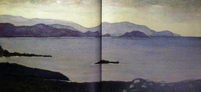
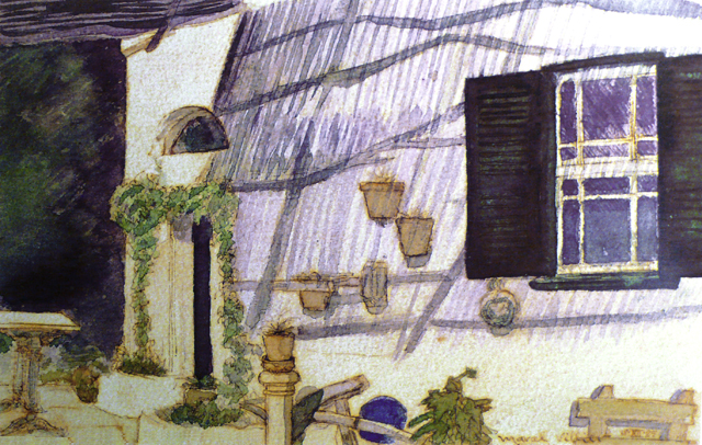
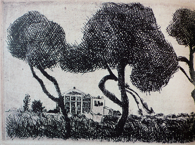
If you like art and the Mediterranean I strongly recommend this book. In it, you’ll find beautifully printed reproductions of Marcel’s landscape and architecture paintings spanning his 40 years on the island. His command of the watercolor technique is clear when he captures perfectly the ephemeral light and movement of the sky and the sea.

Truly amazing is watching him lay down the water and the layers of watercolor tones on paper, all to effortlessly create a moody and evocative piece where your eyes can roam and imagine the story behind.

When looking at his art you can feel the heat of the Mediterranean sun and the freshness of the island breeze blowing through the olive trees. You can sense the dampness of the earth, or the quietness of the stones and doors in an abandoned house.

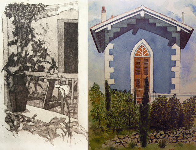
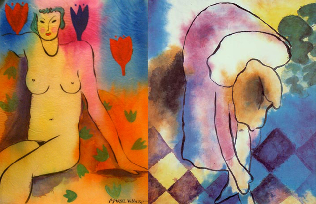
Marcel finds the beauty in the mundane objects and imperfect surfaces. He grants the inanimate objects and houses in his art a distinct personality. His love of storytelling comes through in his work, as he tells his viewers secrets that can only be told through images.

His curiosity and sense of humor transpire everything he does. Marcel’s collection of sculptures made from found objects and drift wood are one of my personal favorites. Rocco the crocodile, the Rustic Acustic Electric Guitar, Lulú the dog and Inspector Morales are some of his colorful characters.

Recently, Marcel was commissioned to design a sculpture to be placed in the transited entrance to Fornells (Menorca). His Dance of the Wind, as the sculpture is called, is formed by three graceful figures that can be admired from different angles of the roundabout, creating interesting and playful shadows as the sun moves around them.

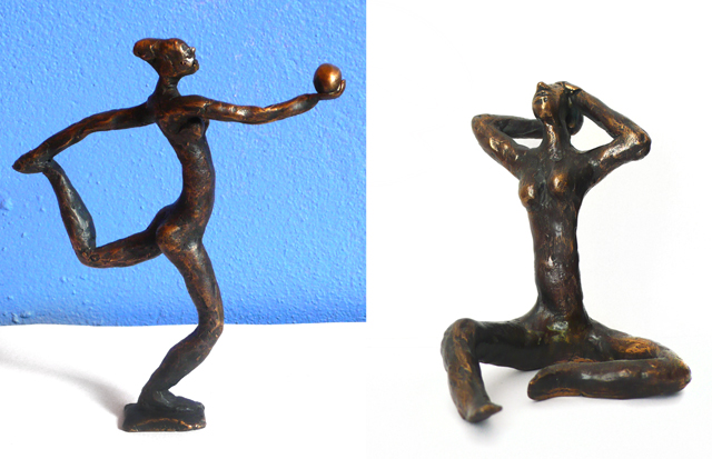
With sylph-like bodies and dynamic poses, Marcel’s bronze sculptures explore the three-dimensional world. The following form part of a limited series of figures that he modeled in wax and subsequently cast in bronze. Whimsical and elegant, they are wonderful examples of the artist’s characteristic style.

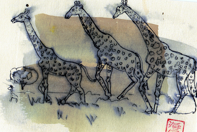
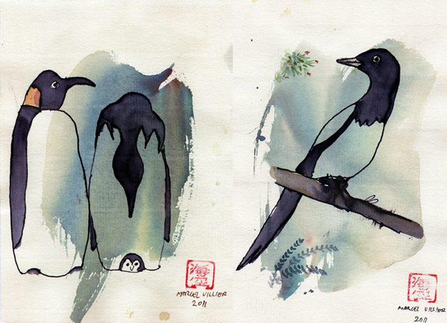
His postcards are portraits of the animal world. Part zoological exploration, part watercolor sketch, the animals in his vignettes each seem to have a life of their own.

BiniChic’s admiration of Marcel’s talent and creativity goes back many years — and in my case, a lifetime. It is with great pleasure that we write about him on BiniChic and share with the rest of the world the work of this wonderful artist.

We are happy to announce that his animal portrait postcards and bronze sculptures will soon be available in a signed and numbered series at the BiniChic Store — opening soon. Stay tuned!

Posted in Uncategorized | Tagged , , , , , , , | 9 Comments

Primary Color

Red is the color of primal energy.  It is the color of passion, love, beauty and of strength, motivation and physical drive. Red warns us, catches our attention, raises the blood pressure and quickens the heartbeat.

Texts from antiquity tell us that the same artisans who manufactured pigments also made medicinal preparations and cosmetics. Color was an important motor for scientific, medicinal and artistic development.

Through the centuries, search for the purest, most vibrant and long lasting hues helped stimulate growth and development. It led to discovering new continents, experimenting with alchemical then scientific methods and establishing the crops, trade and industrial production, which were fundamental to growing world economies.

According to Pliny, a 1st Century AD historian, Egyptians used Madder, cochineal, and archil (a red-producing lichen) to dye the red linen textiles found in the Old Kingdom tombs of the Nile Valley. They also invented mordanting, a treatment of fibers with chemicals that allows the dye to adhere better, thus increasing colorfastness.

Following the Egyptian formulas, Roman frescoes used well known pigments. A few have panels painted entirely with very costly pigments, such as cinnabar vermilion (a sulfide of mercury).

The famous Villa of the Mysteries at Pompeii, whose walls have a background of dazzling Pompeii red, is an example. The raw material was imported from Almaden, in Spain, to Rome, where it was converted into pigment.

To obtain the bright red hues, the cinnabar had to be purified; then synthesized, then ground to the correct fineness. Any mistake and it would turn black. Because of its rarity and expensive production, this red was a status symbol.

In Medieval Europe, as in Rome, the use of vivid dyes was only for the wealthy. The higher quality dyes and mordants were still imported and extremely expensive.

The Madder plant (Rubia Tinctorum) was to be found locally in many parts of Europe – cultivated in Normandy, Spain, Sicily and Lombardy.  The root was dried and milled, to yield a paste or powder.

Pigments made from Madder root, varied from rose to brown and were used by contemporary painters of the day. The color was highly valued in the Middle Ages for the dying of festive clothes, such as wedding apparel. In a way, Madder democratized this color, making the bright red of the upper classes available to the common people.

Alchemists carried out the research in chemistry and the technology of pigments in the Middle Ages. They perfected techniques of heating, maceration, studied extraction and distillation, and experimented with new products such as mineral acids.

This stimulated new ways to produce colors: a deep shade of red is created by the combination of mercury and sulfur. The color created by these chemicals is Vermilion. Naturally occurring Vermilion is called Cinnabar. Below, in its raw form.

Meanwhile, the discovery of the Americas overturned the whole dye trade, especially the market for red—madder, cochineal, and brazilwood. The costly dyes which produced the vermilion-scarlet reserved for the finest wool and silk had replaced Tyrrian purple as the official color of royalty and high officials of the Church. (ie. Cardinal Red)

The prosperous cochineal trade was suddenly overwhelmed by the massive importation of cochineal from the Americas.  Soon after their arrival, the Spanish discovered regions in Mexico where prickly pear cactus (where the cochineal insect lived) was cultivated.  The use of cochineal red dye in the Americas dates from 400BC.

The following image on the left is a drawing from 1777 of a Native South American harvesting Cochineal red; on the right, an illustration of the cochineal insect.

Below, grinding of the cochineal insect to produce the red pigment; a cochineal woven belt; a cochineal plantation.

The word cochineal derives from the Aztec name for the dye, “nochezli” or blood of the prickly pear, transcribed by the Spaniards as “cochinilla”. In 1560, the galleons unloaded 115 tons in the port of Seville.

Cochineal crimson became immensely popular; at Versailles, Louis XIV set a fashion by covering his walls and armchairs and hanging the curtains of 435 royal beds with ruby damask. Notice his red heeled shoes in the following portrait — now we know where that fashion probably started!

While it is comparatively easy to dye animal fibers red — such as silk and wool —  cotton was much more difficult; and until the 17th Century only India knew how. When the use of cotton spread to Europe around 1700, dyers were eager to learn India’s secret — known as Turkish red.

The fabric was soaked in animal fats and excrement and air dried, to prepare it for dying in a madder bath where bull’s blood was added. The cultivation of Madder, which had fallen into neglect, was revived and experts from Turkey were brought to Europe to work the new red cottons.

Red is a primary color between the orange and violet tonalities. When we think of fire — heat — we think of red. It is the hottest of all the colors and experiments show that red-painted walls actually increase the temperature of a room.  Just as cool colors encourage rest and meditative relaxation, so hot colors promote activity.  Red stimulates alertness — warning lights, stop signs, fire extinguishers — but too much hot red can become distracting and draining.

A little red goes a long way. Of all the color vibrations, red is the slowest, so it can become heavy and oppressive. Red appears to advance toward us, making rooms look smaller and more intimate. These spicy hues create a cozy and inviting refuge.  Usually just a red pillow on the sofa, or a red accent is enough to give life to a room. The following photos are from Sara Kaye Photographers.

Red always feels rich. And because it is the color of blood, of life itself, of passion and primary instincts, it has become the color of love. Hearts, valentines, women in red, all point to the allure and magnetic attraction this color holds.

Posted in Uncategorized | Tagged , , , , | 4 Comments

Feeling Good in Your Own Skin

Every girl needs her little black dress — the one you can dress up or dress down depending on the occasion — the perfectly tailored blazer, a gorgeous blouse for a meeting or cocktails, the sailor stripes for the weekend. Well, you get where I’m going: fun and sexy basics. Feminine and unpretentious, Ganni‘s designs fulfill our fashion needs while creating every girl’s true favorites — the ones that remind you how good it is to be a woman.

It was the year 2000, and gallery owner Frans Truelsen founded Ganni in Copenhagen, Denmark. Stripes, cashemere cardigans and the shirt dress gradually became the brands’ signature pieces. In 2004 they took their first steps in shoes. As the company kept growing it got a make-over with a new design team, brand identity and opened its first shops in 2009.

A young brand with an old soul, Ganni has slipped effortlessly into its various phases. The brand has a fresh image and playful approach to life and design — one of their slogans is “Ganni is the classics in a girl’s wardrobe. It is what your girlfriends envy.”

Confident, professional women working in fields such as dance, architecture, fashion and design are Ganni’s brand “ambassadors” and muses.

Drawing inspiration from diverse sources like Tim Walker’s oneiric images, Jean Seberg in Breathless, the nymph-like beauty of Kate Moss and Vanessa Paradis, Kirsten Dunst in The Virgin Suicides, the timeless cities of Paris and New York, and of course, their hometown of Copenhagen — Ganni creates a well-rounded and contemporary line of classics that never fall out of style.

I especially love their concept of “never-out-of-stock”, items that you can always find in store.

Ganni’s shops feel like home. Nice green plants, vintage doors and friendly staff give the space a warm and Nordic feel that works as a perfect backdrop for their clothes and accessories.

“The collection for Autumn 2011 is filled with beautiful, staple items for the independent woman. The collection draws inspiration from the 1940s and 1950s to bring back a more sophisticated ladylike style.” Demure and glamorous, elegant yet seductive, preppy, hipster, a combination of prints and textures, lovely accessories and luxurious boots — all in a rich autumn color palette.

Posted in Uncategorized | Tagged , , , , | 3 Comments

Through the Looking-Glass

Somewhere between otherworldly creatures and precious objects, Lusesita‘s work is original, oneiric and utilitarian all at once. I was first captivated by her objects at a store window: winged tea cups perched atop plates with creature-like legs, bobbling tweedle-dee sugar bowls, a winking teapot all seemed to step right out of a Lewis Carroll story.

Lusesita — otherwise known as Laura Lasheras — is a whimsically creative ceramist born and raised in La Rioja, Spain. Having received her BFA in ceramics at a university where future artisans and artists were discouraged to push the boundaries and explore beyond, she transplanted herself to Barcelona.

It was here that she grew artistically, met and collaborated with some of today’s most renowned Spanish artists — including her boyfriend, illustrator Sergio Mora — and developed her very personal style.

Laura’s work is full of humor, and her vivacious and witty personality shines through every one of pieces. She aims to make precious and unique objects more approachable for everyday use, which is why she chose the name “Utilitarian Ceramics” for the collection of pieces above.

Her recent collaboration with fashion designer Martin Lamothe created an evocative couture collection. Hand made ceramic elephant heads, horns and creatures were individually sewn into skirts, dresses, blouses and headbands creating a unique three-dimensional effect unusual in fashion.

One can nearly hear the delightful sound of the jingling pieces coming down the runway on the models  — it might sound like light rain falling on a tin roof.

We look forward to seeing what wonderful creations come out of Lusesita’s mind. Stay tuned to see more of Lusesita Delicatessen and acquire her objects on our BiniChic Store.

Photos of the Martin Lamothe SS12 Backstage by The Poppins.

Posted in Uncategorized | Tagged , , , , , , , | 2 Comments

Fresh Ideas

Last week the BiniChic team went up north to the effervescent and inspiring metropolis of Paris. Great design was everywhere. The streets, the shops, the flea-markets and the trade show Maison et Objet were brimful of new ideas. Today we’d love to share with you some of the ones that caught our attention.

The above is an image of Molo Design’s softwall + softblock modular wall with LED lights. Molo is an innovative Vancouver-based design studio dedicated to the research of materials and the exploration of space making. We love the contrasts in the modular paper projects — delicate and full of poetic beauty, they are surprisingly sturdy and comfortable. Molo sets out to create objects that define intimate temporal spaces.

The urchin lamp is a fluid and sculptural shape shifting light that provides ambient diffusion of energy. Its elastic and malleable qualities invite to a playful interaction, creating a movement akin to a sea creature.

Making use of unusual materials — or rather, materials not usually used in that form — Ango designs lamps (and furniture) fabricated in a sustainable way using human scale production methods to a world class standard.

One of their most intriguing lamps are made with silk cocoons left in their original state. The lamps are constructed by attaching the silk cocoons to strands of wire which are then attached to a steel frame. The finished product has a soft, ethereal look and gives off a warm light. The same cocoons are also used in their silk-thread form or mixed with other materials such as silicon, polymers, tapioca skin, tree bark or or rattan to create fantastic and quirky lamps that nearly seem to have a life of their own.

Chillart‘s creations are developed with respect for the environment using mineral and organic materials as their basis. With a sleek design and wonderfully smooth finishes, they are physically and metaphorically fresh and cool. Their bold and sophisticated range of colors give the cement furniture an unusual pop.

Lidewij Edelkoort is a true trend forecaster. She not only perceives the trends which may appear in fashion or design magazines, but detects the long wave trends — the ones which approach organically and globally, affecting our perception of our surroundings. On her blog, Trend Tablet, she shares a range of those long wave trends.

One of those long-wave trends is Mohair wool. Since 2009, Lidewij has been counted on by Mohair South Africa to conduct special forecasts about mohair trends to inform, inspire and innovate the fibre in the fields of fashion and lifestyle. Mohair South Africa was established to advance the entire mohair industry, realizing the responsibility that goes with being the most reliable and largest international source of quality mohair (South Africa currently produces 50% of the total world production).

“One of the oldest textile fibres in the world, mohair’s snug sustainable warmth fits precisely with our needs for making a nest, motivated by an ecology-driven climate. Yet its authentic and animalistic characteristics bring us back to the intuitive creativity of a more primal nature; all with its generous, shaggy folds and wisps of hair.” Lidewij Edelkoort

Fresh ideas can be completely new concepts, or new ways of looking at something we already knew. We hope that the new ideas we proposed here today inspire you, and we encourage you, our reader, to send or comment on fresh ideas you perceive.

Posted in Uncategorized | Tagged , , , , , , , , | 4 Comments

Sitting Pretty

An everyday object we have all used, the chair has gone through many phases and changes throughout the centuries. Today we look closer at the Menorcan chair as well as at other fine examples of what we think are binichic chairs.

The chair is of extreme antiquity and simplicity, yet they haven’t always been as common as today. It is known that in ancient Egypt chairs were fashioned with the finest materials available and were used only by the elite. The chair has also often been a symbol of authority.

Before the Renaissance, stools and low tables were the standard sitting utensils for the masses. One of those stools — the church catre, or foldable stool — was the origin of what has become the Menorcan chair, often used to get fresh air on the town streets at dusk.

The image above is an illustration of those chairs by Susan Unger. Below, a catre stool on the left and a Menorcan chair on the right.

The story goes that a man called Miquel Anglada Alzina developed this folding chair in the Menorcan town of Ciutadella in the 1930s. Following the basic shape of the catre, he added the arm and back rests, using canvas for the support. These chairs are also locally known as Coca Rossa, as that was the name of the Anglada family home.

Upcycling is the process by which waste materials or useless products are used to make new materials or high quality products in a sustainable way. This process is something we hold very close to the BiniChic philosophy. Junktion is a group of designers who particularly stand out in this 21st Century movement, turning any unloved or homely object into a work of functional art + seating (and much more). They do it with love, thought and wit:

Junktion designers like to take unrelated objects and join them to see what happens, or sometimes simply turn them upside down on the table, take a step back and think : hmmmm….

The origins of each object are very clear: a palette, window shutters, bike parts, and old trunk… objects that no longer have a use, or others that have been lugged around the world and can’t last another mile, have a second chance.

Other times, when the original design is already streamlined, the finish is refined . Such is the case with the milking stool. A simple tripod with wooden legs has been updated with a aluminum top to fit the times.

And finally, a treat for the eyes — an environmentally friendly design with silk thread tightened around a bearing oak frame. Neither simple, traditional or upcycled, the Silk Chair by Alvi Design plays with the perception of weightlessness, transparency and light. A beautiful and precious utilitarian design — one that looks comfortable as well.

Posted in Uncategorized | Tagged , , , | 4 Comments

Shades of Blue

Color is the way we express and feel.  It is a designer’s vehicle for creating mood and emotion. It is one of the most important items in our tool box.
Curiosity got the best of us, and we wanted to look into colors, one by one. Where is it found in Nature?  What were the chemicals, plants and recipes used to reproduce it over the years? And what does it do for us in a room?

We wanted to start with BLUE, a primary color — meaning one of three pigments which cannot be made from other colors — it just IS. The other ones are yellow and red.  In nature, we find blue both in the sky and in water. Very large open surfaces, stretching to the horizon, where they often meet each other in a flat line.  For this reason, we associate blue with tranquility, peace, calm and spaciousness, freedom.

Of course there are many shades and varieties of Blue, but they basically break down into two families: First is Aqua, Turquoise or greenish blue. Sea water reflects the sky with golden sand tinting the blue reflection from below, creating that Aqua color we know and love. As the water gets deeper, so does the shade of blue until it becomes the inky, ultramarine colors found in ocean depths. We all know that the name for the color is synonymous with water in latin languages — agua, acqua, etc.

The other family of blues comes out of the SKY, with its more cool, even purple-ish hues.  This is the backdrop of everyday — ranging from moody blues on a cloudy day to bright blues of a clear sky, to purple and lavender shades when the sun sets. The perception of transparency and space which is our sky gives this color its association with freedom and peace.

In the age of exploration, dyes and colorants were a precious commodity, as valuable as spices or silk.  Indicum, or indigo blue, was one of the principal imported materials.  The concentrated color extracted from the indigo or woad plant was transported in pans made of compacted powder.  The dye produced from these was more or less purple, depending on the provenance.

A record from 1228 notes that Marseilles imported one of the best indigos from Baghdad. By the 19th Century, Napoleon’s Grand Army imported 150 tons of indigo to dye the uniforms of 600,000 soldiers a year.  By the end of that century the British factories in India were the foremost indigo producers in the world. Below, raw indigo from Java, India and Baghdad.

This is how we got Blue Jeans — dying heavy duty cotton twill with indigo, and making work clothes for the new frontier out of it.

Medieval painters mostly used mineral pigments for color — blues came from Lapis Lazuli or azurite. Medieval manuscript illuminations were painted in monasteries, which obtained their colors from a variety of sources.

Lapis Lazuli was the most prized of blues.  Neither azurite nor indigo could rival it, although they were more ancient.  The process of extracting the precious blue powder from the raw rock was long and arduous, and involved mixing the ground stone in a preparation made of Venice turpentine, resin, oil, and wax, which drew out impurities.  We do not know the origin of this procedure, but there are countless variants of it in the old recipe books. Below, two well-known works by Vermeer and Botticelli which made extensive use of lapislazuli.

Blue is a big color in Glass and porcelain.  Handpainted cobalt–from Blue Willow in China to Wedgewood in Britain is a classic–and that delicate sea glass color has been around since ancient Egypt.

Over the years, in our own studio, we developed many recipes to print and dye our fabrics. Its amazing to see how colors like lawn can turn into sea, which becomes royal, and finally purple haze by adding grains of one color or another. Truly an alchemical art.

We thought you might enjoy seeing some of those recipes, and included some of them in this post. Below are some images of the end result. All designs by Susan Unger.

Use blue to feel peaceful and tranquil.  It’s good for a bedroom, or a background to quiet contemplation (such as an office).  It’s more about thought, rather than passion.  Its sky and water, as opposed to fire and earth.  When you’re looking at a room in your home, think of where  those colors are found in nature.  If they are positioned in the room in a way which resonates with where they are found nature, the emotional connection will be more powerful.  You will bring a bit of nature inside.

All images below are by photographers represented by Sarah Kaye.

Posted in Uncategorized | Tagged , , , , , , , | 2 Comments

Everyday Luxury

Using only the finest raw materials, the most talented artisans and elegantly colorful designs, J.Fleet Designs creates lacquerware to last a lifetime. It is no coincidence that today’s post borrows the tagline used by Susan Unger in her home collections. For many years, Susan Unger and J.Fleet have had a very successful collaboration designing luxury lacquerware for everyday use.

Founded by Emily Rubin Persons in 1995, the company merges the ancient Asian tradition of lacquerware with contemporary design and sensibility. The exclusive designs are handcrafted and expertly inlaid in the best Vietnamese artisan workshops.

Lacquerware refers to products made with a base of rose, cherry, ebony, jack fruit or walnut wood and covered in the resin of the lacquer tree (Rhus Succedanea) which grows mostly in the Northern Vietnamese province of Phu Tho. The natural resin mixed with different mineral pigments takes on versatile uses such as glue, color base and hardener.

Above and below are some of Susan Unger by J.Fleet designs inspired by nature’s tones and forms.

“The luxurious colors and designs are made by layering foils and hand-mixed lacquer colors. We also use the traditional arts of mother-of-pearl inlay, burning and inlaying cracked eggshell. The rich variations in color and texture that occur in creating our lacquerware make each piece uniquely beautiful and a treasure to own.”

Above these lines, an image of an artisan inlaying silver foils, alongside a detail of the end result. Although not traditionally used for lacquerware, this technique came about when trying to find the best way to reproduce Susan Unger’s unique silkscreened designs on J.Fleet’s products.

As Emily explains: “ After several attempts to “inlay” the material under the clear lacquer, the factory owner was able to figure out how to create the designs by layering colors over layers of silver foils. This opened up a whole new design direction for J.Fleet Designs. This was a truly new and inventive technique, yet the factory owner still only used the traditional materials of the ancient craft.  This began the new and very unique look for me as I was able to offer something no other factory was able to produce.”

Empty duck eggshells are glued to the lacquerware to create the intricate effect seen above. The next steps will be to apply many layers of liquid lacquer — letting each coat dry before applying the next — and finally polishing and rubbing under water to bring out the shine.

Each product, regardless of the technique used to decorate it usually goes through 20 stages, and takes no less than 100 days to complete.

Using Mother-of-Pearl is also a very laborious process, by which the inside of seashells are cut into 2mm pieces and carefully given the desired shape. We love how J.Fleet fuses classic materials with contemporary prints and designs — something hard to find in a traditional cottage industry.

The product line includes serving trays in all sizes — ranging from oversize ottoman trays to small cocktail and vanity trays — bathroom accessories, serving bowls of all sizes, placemats and boxes.

The care of the lacquerware is simple, just use “warm soapy water and a sponge to clean lacquerware after food use. Furniture polish or car wax can be used to buff out fine scratches that occur from regular use. Please use horn or wood utensils for serving the food as metal will chip or scratch the surface. We do not recommend these items in the microwave or dishwasher. A little nail polish can repair small chips in the lacquer.”

Below is the Martini Glass collection, a new collaboration between BiniChic and J.Fleet Designs.

Their new collection is now up on their website — you can also find out where to buy their products here.

Their hand made process allows for high customization of the product and low production minimums. J.Fleet Designs has created special collections of lacquerware for such select customers as The Metropolitan Museum of Art (below, on the left), The Four Seasons Hotel George V in Paris, Calvin Klein Home, amongst others.

They are the perfect way to add a luxurious detail to any room, and unique gifts for the holidays.

Posted in Uncategorized | Tagged , , , , , | 7 Comments

A Sunny Disposition

We love summer, and all that comes with it. Going to the beach being on the top of the list, we dedicate this post to one of the basic summer accessories: the beach bag.

One of the classics in the Mediterranean is the woven esparto basket with long handles also known as senalló. Known for its sturdiness and flexibility, it has been used throughout the centuries to carry vegetables, tools and other objects. Although originally a farmer’s bag, the baskets now come in many sizes and variations. Leather handles, ruffles, clasps, and mirrors have been added to make this the ultimate fashion accessory. Personally, I have always kept to the classic style with long handles.

However, if I were to personalize my senalla, I think I would go for the version dip-dyed in paint. I love its simplicity and how easy it is to make at home. The basic idea is to take your basic basket and dip the bottom half in a plastic storage bin filled with a few inches of water-based latex paint. Et voilà!

Many of the baskets sold in shops are good-looking machine-made versions, like the one below on the left, which you can get through this online shop. However, if you would like to carry you beach essentials or go to the Farmer’s Market with an original hand made senalla basket, you’re in luck. The versions of the senalla below on the right are hand-made to order by Antic Mallorca.

Another one of my favorites is the canvas bag. Used extensively by sailors — they fold flat and thus are easily stowed on a ship — canvas bags are a sturdy and timeless classic. A few weeks ago I fell in love with this version by Carga Bags — you can buy them on their website. There are 200 units hand made in Buenos Aires with #10 “Cabeza de Toro” (Bull’s Head) industrial-grade canvas. The folds on both fronts give the bag ‘structure’ and shape, allowing it to stand by itself even if empty.

Not directly Mediterranean — but still perfect for the summer sun — these bold and colorful bags are perfect to wear with a white Ibizan dress. From the Caribbean peninsula of Guajira — covering part of Colombia and Venezuela — hails the susu (as these bags are known in the Wayuú language).

They are hand-made with local wool by the indigenous women of the the Wayuú peoples. The designs are inspired by their spiritual culture and include traditional ancestral designs that have been passed on for centuries. You can get original susu bags here.

Posted in Uncategorized | Tagged , , , , | Leave a comment

Form Follows Function

“Good design is timeless. For me, the simplest and most economical design solution, is the most elegant one.” Regan Bice

Binichic has known and admired the architect Regan Bice for many years. He had an architectural studio in Mahón during the seventies. He designed and renovated homes in Menorca.  His primary inspiration was the vernacular architecture of the island. Regan shared his photographs of classic Menorcan farmhouses. They represent elegant solutions using minimum resources.

This island which developed and held on to its own style for centuries, was his education.
Ironically the most ancient, primitive ways of building inspire modern architecture because they both come from the same principle: form that follows function. The elegance they have in common is because they do more with less.

Regan explains, “While meeting the need for a home and workspace for family and animals, Menorcan architecture is a direct response to a series of conditions: wind, water, sun, and available materials, to name a few.”   Early architects solved the problem as directly as possible. Taking into account the orientation, topography, site, wind direction and available materials, the solution is dictated by the conditions.

“This is the beauty—there are no arbitrary or consciously decorative elements. LIMITING THE PALETTE is one of  the secrets to success of Vernacular Architecture”. Often, when people have many choices of building materials, pre fabricated elements and styles, the clarity and simplicity of the design is diluted.

“I always tell my clients if an element of the design can’t be explained or isn’t part of the end solution, it shouldn’t be there.”

Having only three materials available to construct is what gave these structures their unique character:

1. Limestone: which was found in the fields as well as quarried, and white wash, which protected and coated the stone. Sun made it hard and white. The walls and even ceilings are made from limestone.

2. Tile:  made from red clay, used on the roof and floors.

3.  Wood: used in limited places such as window frames, doors, and beams.  These are the materials which create the volume of the buildings.

In this collection of photos we can see how the Menorcan farmhouse is a response to the following natural conditions:

1.  WIND
– Small windows are on the north façade
– Large windows face south
– Porches protected from wind and rain

2.    WATER
– Drinking water was stored in a cistern—which often provided the stones to build the house.
– Water collection systems provide an important aesthetic, while doing their job.
•    In these photos we can see many different forms — tile to tile, tile to rooftop, carved out wall, etc

3.    LIGHT
– Farmhouses are oriented to the south
•    Larger windows with porches and patios provide protection from the wind while taking in warmth and light.

4.    PROTECTION/MAIINTENANCE
– The whitewash over the years gives the stones plasticity and rounded shapes that change continually as the sun shadows the forms.
•    It defines the paths on the roof where the tiles are set with mortar, allowing farmers to access the entire roof.
•    It allows an economical way to manage the roof tiles while creating a powerful esthetic.

5.    FIRE
– To heat and to cook, fire and stoves were essential.
– Chimneys needed to perform efficiently in the northern Tramontana winds and rain.
•    Their shapes and sizes were all designed to get the smoke out and help the fire burn.

We end our photo journey through Menorcan farmhouses with the most important room of the house–the kitchen. The hearth provides food and warmth — a place for gathering, sustaining and nourishing the people who live there.

All photographs from the Regan Bice and Josep Mascaro collection.

Posted in Uncategorized | Tagged , , , | 5 Comments